Maxematics · Identity study · Appendix

How we got here.

The record of the decision: the question you raised, the principle we worked to, the ten logotype treatments built and tested against it, and the three vertical lockups the approved one was chosen from. Kept for reference — the finished identity lives on the main page.

Client
Maxematics — Max Schwarzkopf
Explored
10 logotype treatments · 3 vertical lockups
Prepared by
Chevis Zhou · AethrDesign
Outcome
Option 06 · vertical lockup B
01

The question on the table

You asked whether max should be visually separated from ematics. It's the right question, and it was worth answering carefully — this is the one asset that appears on every page, every email signature, every flyer, and every browser tab for the next several years.

Our answer was yes, separate it — but not by making it bigger. The first instinct is to set MAX in capitals. We built that version, put it next to the logomark, and it confirmed exactly what you noticed on your own: it collides. Below is why that happens, and what we did instead.

A

The name is a portmanteau, and portmanteaus fail silently

"Maxematics" only works if a reader catches max inside it. If they don't, the eye auto-corrects to "mathematics" and the joke — along with the founder's name — disappears. A visitor who never notices Max is in the name has lost the single most personal thing about this practice. That's the actual problem worth solving; it isn't decoration.

B

The wordmark has one x-height. Capitals introduce a second.

Set entirely in lowercase, the logotype has a single horizontal band of weight — calm, and a quiet partner to a logomark that is deliberately loud. Capitalising MAX raises three letters to cap height and puts a second stack of mass directly beside the mark's tallest point. Two loud elements, 8px apart, competing. Your read was correct.
maxematics. Collision
C

Whatever we choose has to survive at 20 pixels

The navigation bar renders the logotype at roughly 20px tall. At that size, contrast in weight loses most of its effect and contrast in colour loses more still — and both vanish entirely in a black-and-white flyer, an embroidered polo, or a fax-quality PDF. Any solution that depends on being able to see a subtle difference is a solution that only works on your monitor.
02

The principle we worked to

Emphasise nothing. Substitute one glyph.

There are only two ways to make part of a word stand apart, and they behave very differently.

Family A — Emphasis

Adds mass

Change the case, the weight, or the colour of max. Everyone understands it instantly; it's how SS&C Blue Prism, FedEx and hundreds of others handle a two-part name. The cost is that all three levers work by adding visual weight — the exact resource already spent on the logomark. These were legitimate options, and we built them properly rather than dismissing them.

Family B — Substitution

Adds meaning, not mass

Leave every letter at the same size, weight and colour — and replace one of them with a different form. This is the move behind the Anthropic wordmark you pointed us to: the final i is stripped of its dot and tilted into a backslash. Nothing is emphasised, nothing is enlarged, and yet the mark becomes unmistakable and impossible to set by accident in a default font. It costs no space and no ink. For a wordmark that has to sit beside a busy logomark, this is the more disciplined tool — and Maxematics happens to contain the perfect candidate letter.

The candidate is the x. In max, the x is both the last letter of the name and, in mathematics, the multiplication sign and the universal symbol for the unknown quantity — the thing a student is here to solve for. It is also already drawn inside your logomark, as one of the four operators. Replacing the letter x with a true × changes nothing about the wordmark's size, weight, case or colour, and yet it marks where max ends, states the category without a tagline, and ties the logotype to the mark beside it. One glyph, three jobs.

03

Ten treatments, tested

Each is shown at true navigation size on both light and dark, since the site uses both. For every option we recorded what it achieves and what it costs — including for the ones we didn't recommend, because the trade-off is the useful part. Option 06 is the one that was approved.

04

Why option 06 won

The × substitution set in the brand violet. It was the only treatment that separates max without spending any visual weight, and the only one that gets stronger rather than weaker as the logo gets smaller.

Approved logotype

Maxematics logomark maematics.

01

It separates without shouting

Same case, same weight, same x-height as every other letter. The eye stops on max because the form changed, not because it got heavier — so the logomark keeps its role as the loud element.

02

It says "maths" with no tagline

A multiplication sign inside the name states the category before anyone reads a word of copy. That work was being done by the logomark alone; now the two share it.

03

It survives every size and every ink

The × is a bolder, simpler shape than a lowercase x, so it holds at 16px and in a single colour. In black-and-white print the differentiation is still fully intact — weight and colour options are not.

04

It can't be typed by accident

The logotype is now a drawn asset rather than a word set in a font. That is what makes a wordmark defensible, recognisable, and worth protecting.

The two runners-up, for the record: Option 05 is the same substitution in the standard ink colour — all of the structural benefit, none of the accent. Option 03 (weight split, 700/500) was the safest boardroom answer and remains a perfectly good mark; it would simply have traded distinctiveness for familiarity.

05

Three vertical lockups

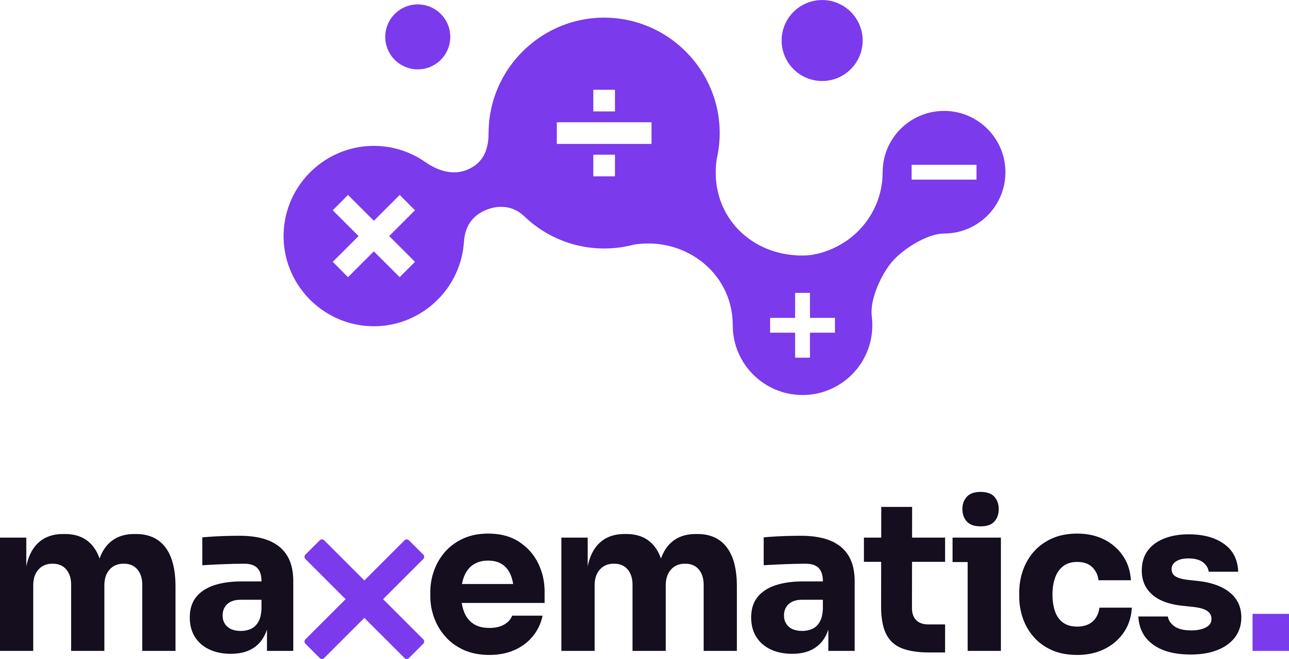
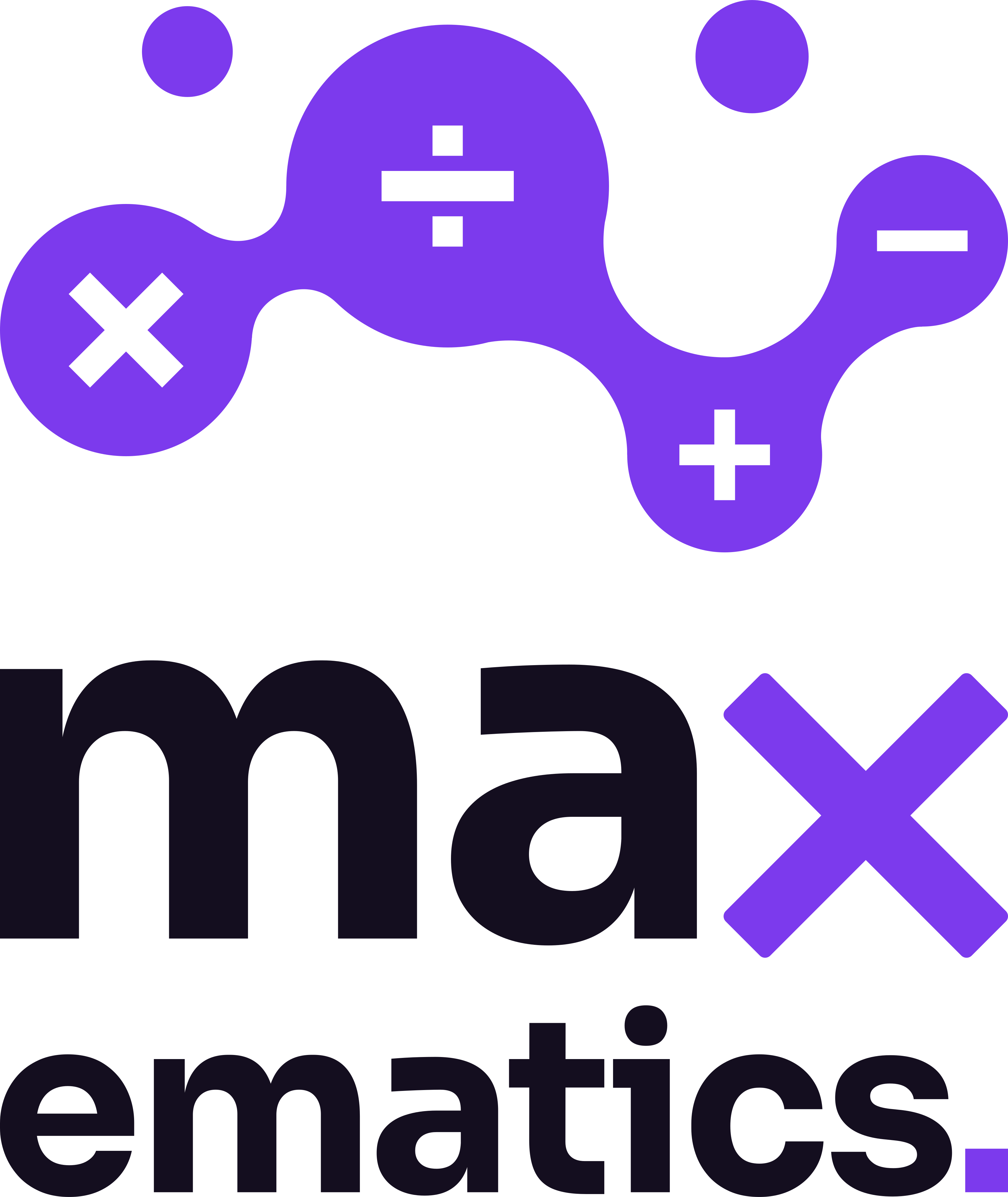
The horizontal lockup is the primary mark, but it is the wrong shape for a T-shirt, a tote, a stamp or a square avatar. Three ways to stack it, drawn at production quality so the choice could be made on the real thing rather than a sketch. B was approved and became the official vertical mark; A and C were discarded.

AMark over full nameNot used
Stacked lockup A
Best for

Résumé headers, letterheads, anything read close up on paper. The name stays a single unbroken word, exactly as on the website.

Trade-off

The widest of the three, so on a T-shirt the name has to be set small to fit the chest — which is where the fine letterforms start to suffer.

BSplit at the ×Approved
Stacked lockup B
Best for

The most compact and the boldest. Both lines are set to the same measure — the device your original logo already used, with MAX over ematics — so this is the version that feels most like a continuation of it.

Trade-off

Breaking the word in two states the max point loudly, and softens the "one word" reading that Option 06 was chosen to protect. Strong on merchandise, quieter on stationery — which is why the horizontal lockup stays primary.

CJustified badgeNot used
Stacked lockup C
Best for

Square and near-square spaces — profile pictures, stickers, embroidery, a stamp. The mark is set to the exact width of the name, so the two lock together as one block with no floating.

Trade-off

The logomark carries almost all the weight and the name reads as a caption beneath it. Excellent where the audience already knows you, less useful as a first introduction.

The outcome

The Maxematics identity, delivered

The approved logotype, both lockups in five colourways, the usage system, and the full artwork package.